
Considering my blog is for me, the most newbie of newbies, it must seem hopelessly naïve to the more experienced of you and yet every now and then I get a tweet on the lines of ‘hey, I never knew that, thanks!’
Which is of course very encouraging. Perhaps in time it will become sophisticated enough that people would be prepared to comment on the blog itself that they hadn’t known something. We all start out knowing nothing, and we all learn. Some (usually me) more slowly than others.
Anyway, my latest field of learning has been the first cautious steps into POD. There simply isn’t a print-on-demand option out there that is praised by everyone, so it has taken a year to get this far, bite the bullet, and give it a try, one baby step at a time. I went with CreateSpace, because the ISBNs were free and immediate, and because the general consensus, after all my research, was that it was fairly idiot-proof, and even its most vocal critics weren’t saying too many alarming things. One downside is that I won’t be able to use the ISBNs outside Amazon but I’m only selling on Amazon anyway.
So, idiot-proof? Actually, yes. They supply a template, and you copy and paste your manuscript into their format, and spend hours (and hours and hours) formatting and tweaking and uploading to their previewer, and blushing over oddities spotted in the process. Repeat.
The cover options were pretty simple too. Choose one of their covers from scratch, or choose one of the template covers that permits you to add your existing artwork to the front cover (with some limited positioning and colour options) or expand your existing artwork to create your own back cover. They then have templates that will format it and add the spine lettering for you. Obviously these are the free options, and as always with indie publishing, the more money you have to throw at the process, the better the results. But you can put together a fully formatted book, and cover, having spent nothing but time. Lots of time.
One reminder to the ignorant such like what I am. CreateSpace threw me slightly by insisting my artwork had to be a minimum of 300 dpi, but this just means you have to resize your pixels. I eventually resized to 4000 x 3048 and that worked quite nicely.
CreateSpace (and no doubt the others) then provides a full digital proof to gloat over online. They do recommend you get a physical proof, and that was a tiny setback, because one by normal post was pencilled in for January delivery. I can’t wait until January, not after getting this far! So I went for the most expensive option (about four times the price of the book) and received it in two days. Joy.
Being a newbie, I had of course made several mistakes, so the joy wasn’t unmixed with chagrin. My title, although it had looked perfect on the digital preview, was slightly too far over, so the B of Buckle was crowding the spine and looked ridiculous. I had chosen matt over glossy; but with a very dark cover, there were odd shiny patches, and fingerprints showed up hideously. I think I shall be going glossy instead. I hadn’t sized my cover properly, so there was a deep black frame top and bottom, a skinny black frame either side. And it was so dark, it looked really dull and glum.
Any decisions you take can be changed at any time, as can any errors you suddenly pick up in the book. (Despite all those hours and hours you spent, above.)
I went for 11pt (11pt or 12pt are standard) type, and a 1.15 line spacing, because it is a novella, and would have been quite thin using normal line spacing. It makes it light and airy to read, which considering it is ideally a weekend / holiday book, I think is better. For the same reason I went for a 5 inch by 8 inch size (the default offered is 6 inch by 9 inch, but with many other options) and I’m pleased with the size. The book’s price is calculated by the page (hence the popularity of 6 x 9, a 12pt prize size, and regular line spacing, for word-heavy books). My book is around 42 thousand words, the proof copy is half an inch (around a cm) thick, and would be priced at $7.53. That was having chosen cream paper, which is more expensive. Because I chose a light font, and more because some of the CreateSpace critics said that some local (book depository) printers had printed on white anyway, I will be checking the price difference if I go with white instead. $7.53 is too high a price.
I played with a few generic cover options, because my cover was so dark, but they’re obviously not designed to, well, put professional cover artists out of business. I tried about eleven, and have a photo below of one option – the pre-formatted author name went in an odd little hoop across the pic, but removing it (and pasting the author name on the pic instead) meant no author name on the spine.
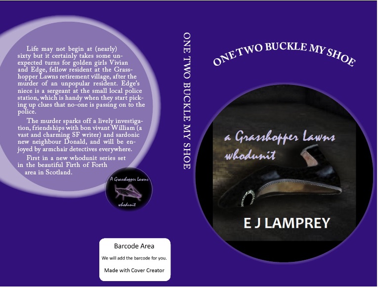 For a POD sale, no problem, the buyer knew the name anyway. But if there was ever to be a chance of bookshop sales?
 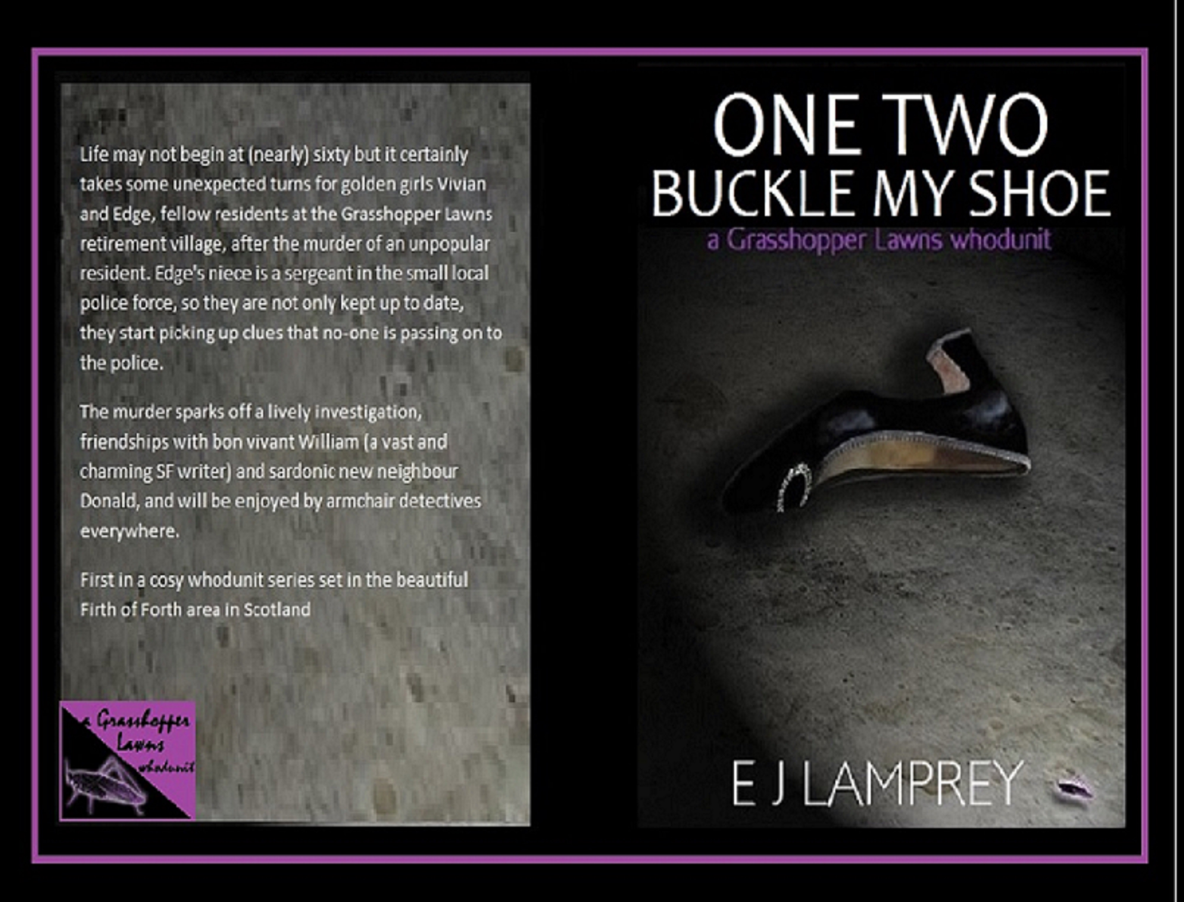 ridiculous. I fiddled a bit more with my own cover, and managed to improve it slightly. Enough to give it a try, anyway. Put it this way, I can’t shake the feeling I will be the only person buying it, after all.
At the same time, the whole point of printing copies is to be able to send them out for review, and I don’t want the reviewer rejecting it on sight. Decisions, decisions.
Anyway, that has been the POD experience to date. And to tell you the truth—so thrilling. I’m a paperback writer! One paperback so far, granted, and my sales will never threaten the forests of the world but a book in the hand is about the most exciting thing that has happened in this whole year of very exciting things.
